
Getting to know me
Home and About introduce the person behind the work: a miniature world, a personal story, creative interests and a way to keep exploring.
Visit AboutGetting things ready…
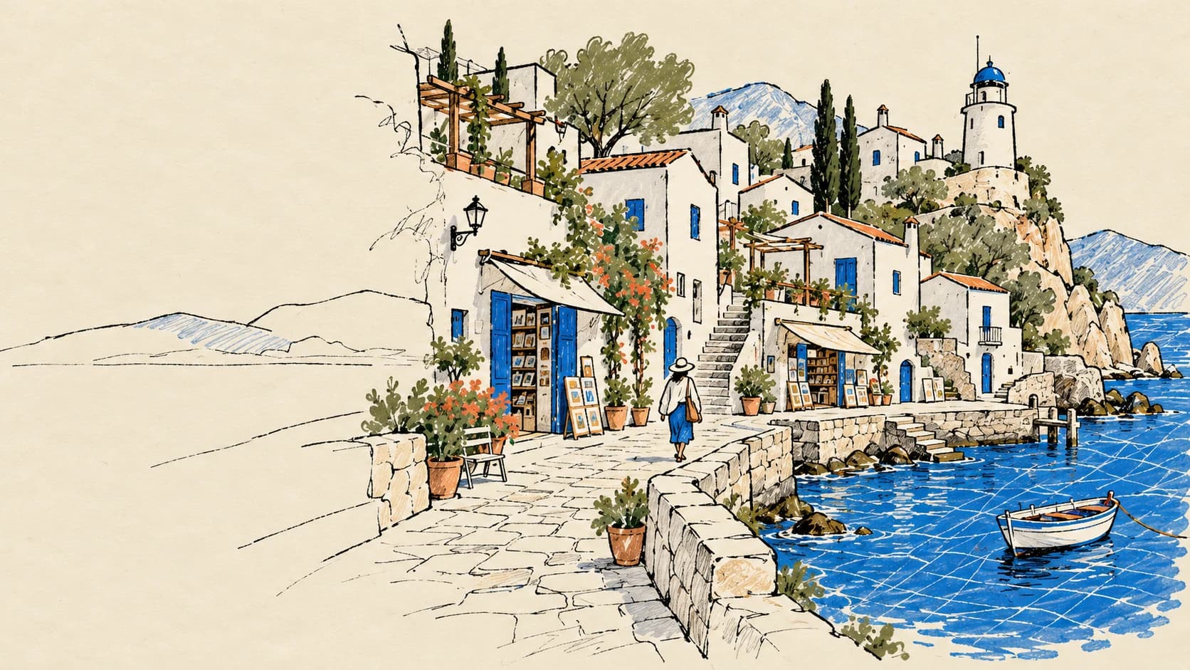
I wanted a space
to show who I am.
A portfolio can tell you what someone does. I wanted mine to give you a feeling for the person doing it.
I build business systems, make games, experiment with developer tools and draw. A single neat grid can hold all of those projects, but it does very little to explain the curiosity connecting them. Daily Commit is my attempt to give that curiosity a home.
It starts as an introduction: who I am, what I am working on, and how to get in touch. Then it opens into different places. There are projects to explore, stories to read, small interactions to try and routes for the people who arrive with a specific reason.
The site is useful to me as well. Behind the public pages is the Vault, my personal space for preparing content and managing the work around the website. MCP connects selected tools to the assistants I work with. The public experience and the work behind it belong to one platform, with clear boundaries between them.
“Show the way I think
through the things I build.”
The aim of the design. The case study itself follows that idea: a drawn world to explore, with the actual system explained along the way.
A website has more than one kind of visitor. The route should fit the reason they came.
Follow the coastline → Swipe to explore the map.
Home and About introduce the person behind the work: a miniature world, a personal story, creative interests and a way to keep exploring.
Visit AboutThe Projects gallery provides the wider collection. The recruiter page brings experience, skills, selected projects and the CV route into a shorter, more direct read.
Visit the recruiter pageThe Work page leads into Services. New enquiries get a clear way to start a conversation, while existing clients have a separate entry to their own workspace.
Visit WorkThe visual language can change when the job changes.
The navigation still has to tell you where you are.
They need a useful view of the work: project progress, visible milestones, published reports and a place for comments or change requests. The client portal gives that relationship its own space instead of sending people through the public portfolio each time.
The client’s view is separate from my Vault. Only the appropriate client’s information and the material made visible to them belong there.
The client entranceThe next step should be clear
on both sides.
The case study is part of the design work. Its structure should help explain what the project is for, what it covers and why I built it that way.
I do not want every project to inherit the same presentation and simply swap its title. A recording library, a habit game and an operations system ask the reader to understand different things. Their pages should help with that.
Some need a careful written account. Others benefit from a working interaction, a visual model or a sequence that unfolds as you scroll. The shared philosophy is to make the explanation specific. These are a few of the pages where that idea is most visible.
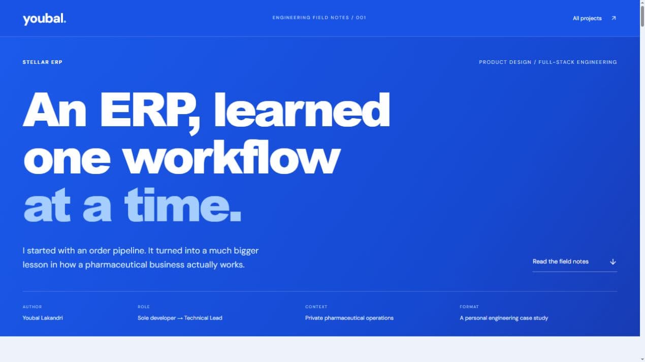
The ERP case study reads like engineering field notes. Large editorial headings, numbered figures and a continuous paper explain how an order pipeline grew into a wider operational system.
The restrained page gives the workflows room to make sense. It makes the reasoning, ownership and sequence of the work easier to inspect than a wall of feature cards.
A small selection of distinct, local case studies. Product landing pages and external destinations sit outside this collection.
An editor for a library. A game world for a progression system. The visual metaphor should make the work easier to understand.
Use motion to show a handoff, a relationship or a change of state. A reader should understand more after the animation.
Actual captures, concrete decisions and clearly labelled demonstrations give the story substance. A private project can still be explained honestly.
Not every detail has to be a feature. Some details are there because they make a place feel inhabited.
The personal site has a day and night language. On this page, the sun changes the scene; the drawings stay legible while the mood shifts.
Try the sun at the top.The home page’s miniature scene gives the site a sense of place. Here, passing wind, sea marks and small signals carry the same interest into a sketchbook.
Quiet movement, around the edges.Drawing and programming are both part of my work. Handwritten annotations, irregular lines and collected images let that show through the interface.
Not everything needs a perfect edge.The ambient movement can be paused. Reduced-motion preferences keep the illustrations still.
The public site is an invitation. The Vault is my personal space for the work that happens behind it.
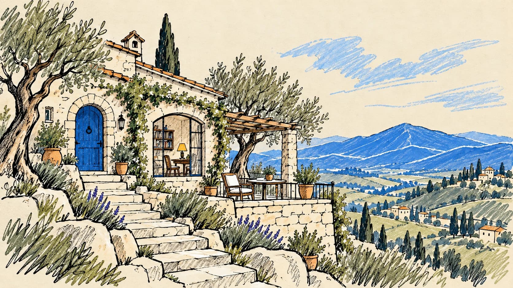
Because a website has a life after you finish designing its front page.
A new project needs a write-up. A profile needs an update. An enquiry arrives. A proposed change needs a decision. I wanted a personal place to handle that work without turning the public site into an administration screen.
The Vault brings the writing desk, site content controls, project documentation, inbox and review tools into an owner-only workspace. It is part of the same system, with a different purpose and a quieter interface.
It also gives the assistants a useful place in the workflow. They can work through the tools they have been allowed to use, while I keep a place to inspect content, review proposals and make decisions.
A personal space.
Not another public page.
The Vault checks the owner’s session. Client workspaces have their own access boundary. Private routes are excluded from the public sitemap and public analytics, and are not source material for public-page tools.
MCP gives the assistants I use a defined way to work with the site’s content and tools.
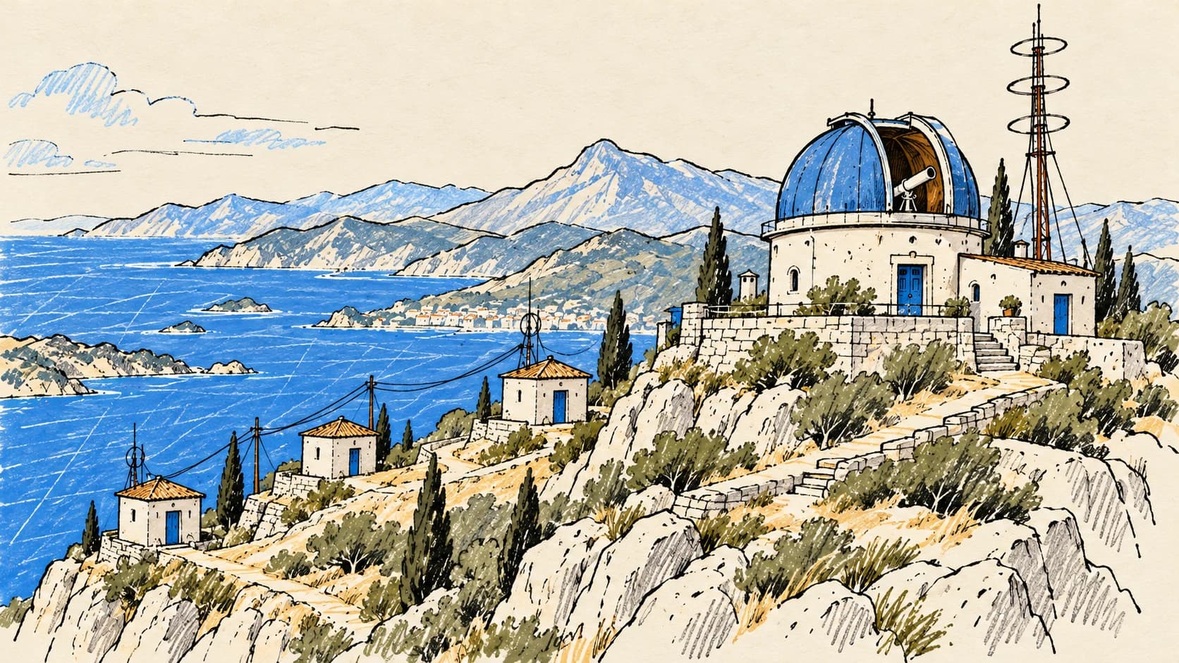
Without a connection, an assistant only knows the piece I have pasted into a chat. The site’s MCP tools let it read the current public profile, inspect a supported public page, prepare writing or help review search information in the context of the website itself.
The connection is not a general instruction to do anything. Each tool has a specific job, and the server decides which tools the identity may use. The local and remote MCP entry points share the same tool definitions.
The signal desk below lets you follow an example through the publishing, search, profile and mail workflows. The important part is what each connection makes possible—and where my decision still belongs.
“Help prepare a new project article.”
SITE CONTENTget_postsave_postpublish_postThe next action stays within the tool’s defined scope.
Separate assistant credentials can be granted particular areas. The server checks that identity before exposing the corresponding tools; revocation takes away future access.
SEO proposals preserve a before-state and go through owner policy, approval and revision checks. Changes to product source follow a repository review path.
Public-page readers reject private routes. Content tools edit defined content, not arbitrary application code. Inbox tools read mail; they do not send replies.
Search is part of maintaining the place. The site can read public-page audits and connected search and traffic reports, keep proposals and show a change history. A connection being available does not prove an improvement in rankings or visits; those claims need actual measurement.
The atmosphere sits on top of ordinary engineering decisions: content, components, access checks and a way to keep changing the site.
Next.js, React and TypeScript provide the platform. Page-level components, CSS modules and local visual systems let the case studies differ without changing the purpose of their links, headings and navigation.
Editable profile and publishing content are separate from the layout. The writing desk supports rich Markdown content, while approved content updates can refresh the public view. Code, static product material and visual changes still belong in the repository workflow.
The site experiments with Pretext typesetting, rich text editing, syntax-highlighted examples and a downloadable CV PDF. These serve different reading tasks: a quick introduction, a substantial case study, a developer guide or a document someone can take away.
Three.js powers the spatial worlds elsewhere on the site. This chapter uses illustrated assets, sketch-like vector details and lightweight ambient animation. Native scrolling stays in charge; movement can be paused or reduced.
Next.js · React · TypeScript · PostgreSQL · MCP SDK · Three.js · Motion · Rough.js · Pretext · Tiptap · Shiki · React PDF
Different tools for different parts of the site; every page does not load the whole collection.The fictional places in this chapter use AI-assisted illustration developed from a supplied visual reference. The interface, annotations and ambient movement are implemented in code; the collected page captures show the actual site.The biggest lesson has been to give each part a reason to exist. A playful world needs to lead somewhere. A case study needs to explain the work. A private workspace needs to stay private. An assistant connection needs a clear limit.
Daily Commit is still growing. Some parts are experiments, and the design changes as I learn what is useful. What stays consistent is the intention: to make a place that shows my work, my interests and the way I like to build.
Thanks for taking the long way round.